

Creating a Modern Jewellery House Inspired by Heritage and Reward

January 11, 2026
Nottingham, UK
8 Weeks
Bespoke Brand System
Luxury Identity Concepts
Gielden began as an ambitious vision to expand anestablished luxury watch business into the world of High Jewellery withoutcompromising its prestige.
Rather than extending the existing brand, WWWonder identified the opportunity to create an entirely new jewellery house with its own identity, positioning and story. From naming and strategic positioning to visual identity, website design and editorial copywriting, every element was crafted to establish Gielden as a modern luxury brand rooted in heritage, craftsmanship and enduring value. The result is a distinctive jewellery house designed to stand confidently alongside some of the world's most respected names.
Challenge
The client had built a successful reputation within the luxury watch market but recognised an opportunity to expand into bespoke andHigh Jewellery. The challenge was ensuring this new venture elevated the existing business rather than diluted it. Simply extending the current brand risked undermining both propositions.
The new brand needed credibility from day one, capable of standing alongside established luxury jewellery houses while remaining connected to the values and clientele of its parent company. This required more than beautiful design—it demanded a compelling strategic narrative, an original name with genuine heritage, and an identity capable of communicating craftsmanship, permanence and exclusivity. Every decision, from positioning and symbolism to language and digital experience, had to reinforce the perception of a modern jewellery house with timeless foundations.

Approach
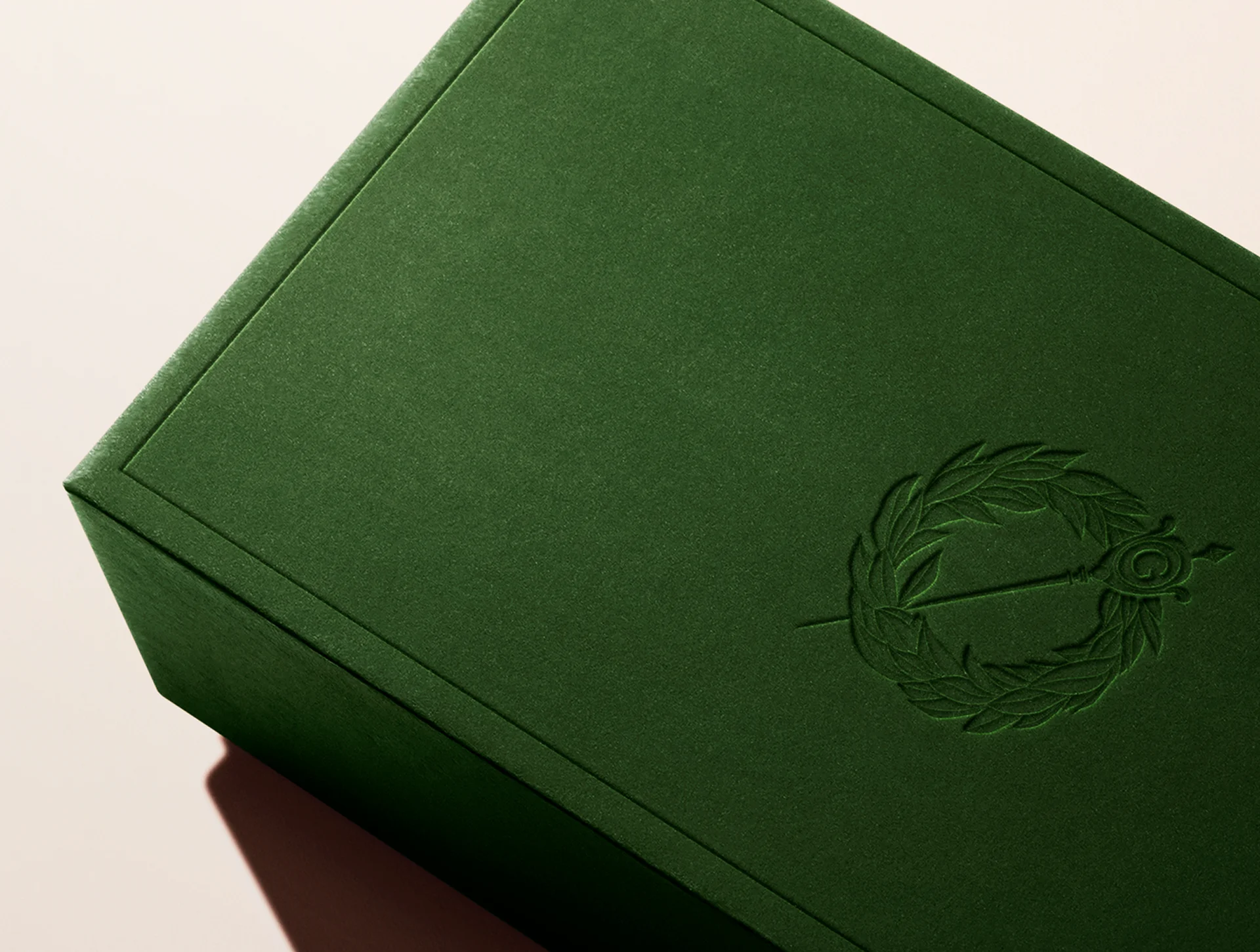
Our process began by exploring the conventions of luxury jewellery branding, analysing naming structures, heritage maisons, linguistic traditions and the cultural significance of High Jewellery. Rather than creating another contemporary lifestyle brand, we developed a positioning centred around enduring craftsmanship and meaningful milestones.
This research led to the creation of Gielden—a contemporary interpretation of an Old English word meaning reward. The concept became the foundation for the entire brand, reflecting jewellery as a celebration of achievement, commitment and life's defining moments. From this strategic narrative we developed the visual identity, emblem, tone of voice and website, ensuring every touchpoint reinforced the same philosophy. The result is a cohesive luxury brand that balances British heritage with contemporary elegance, positioning Gielden as an emerging jewellery house rather than simply another retailer.
Process
Every stage of the project combined curiosity with commercial validation. Historical research into luxury maisons, heraldry and Old English language informed the naming process, while competitor analysis identified opportunities to differentiate within the High Jewellery market.Alongside creative exploration, we validated domain availability, SEO competitiveness, company registration and social media handles to ensure the chosen name was both distinctive and commercially viable.
With the strategic foundations established, we developed multiple visual identity routes inspired by heritage craftsmanship, including emblem concepts, typography systems and luxury material palettes before refining the chosen direction into a complete brand system. This extended into website design and editorial copywriting, producing a digital experience that reflected the same level of refinement and permanence as the jewellery itself.

Solution
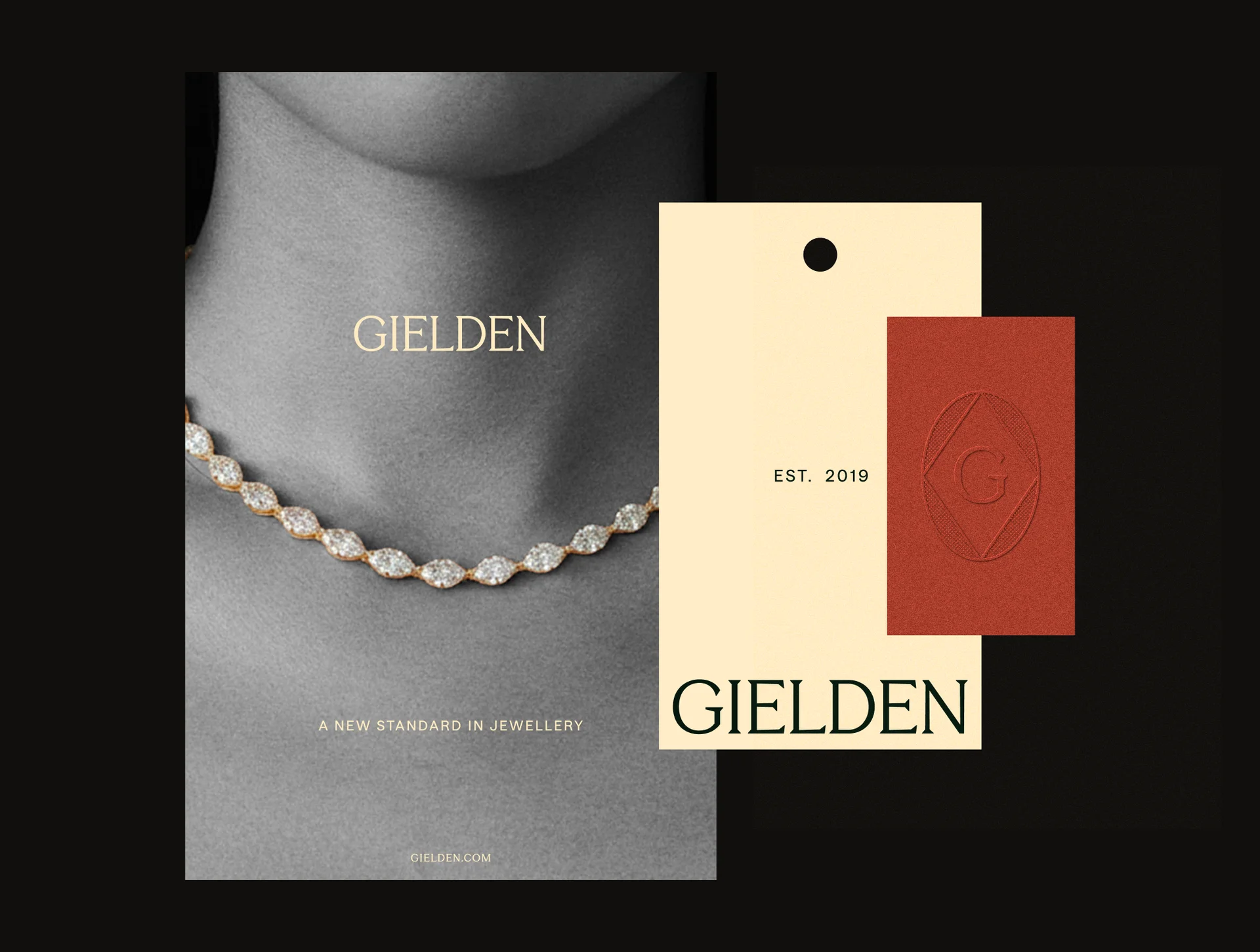
Gielden launched as a complete luxury jewellery brand with a clear strategic purpose and a distinctive identity capable of growing independently. The new positioning established the business as a contemporary High Jewellery house, centred around craftsmanship, timeless design and celebrating life's greatest rewards.
Beyond the identity itself, the project delivered a complete brand ecosystem including naming, storytelling, verbal identity, visual language, website design and editorial content. Every touchpoint was designed to communicate confidence, restraint and enduring value, allowing Gielden to occupy a premium position within the luxury market while remaining true to its British heritage. Rather than simply creating a logo or website, WWWonder helped transform a business opportunity into a fully realised luxury brand prepared for long-term growth.




.webp)
