

Evolving a Family of Care Brands Through Design and Technology
July 1, 2026
Matlock, UK
14 Weeks
Average SEO position improvement for tracked keywords
Increase in user website visit duration
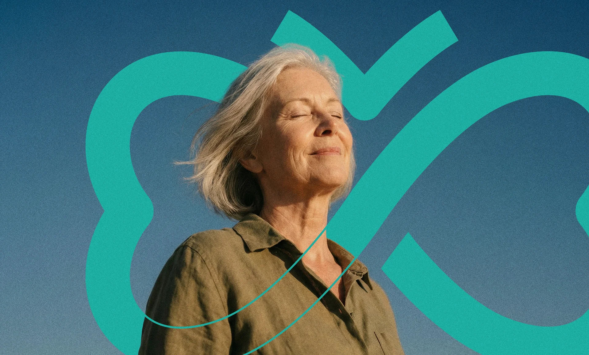
Careport Group partnered with WWWonder to modernise its growing family of care brands through strategic branding and future-ready digital experiences.
While Mariposa Care and Papillon Care had established individual reputations, Careport itself lacked a clear identity as the parent organisation connecting the group. Our challenge was to create a cohesive brand ecosystem—giving Careport a distinct personality while preserving the individuality of its subsidiaries. Through a combination of refined visual identity, modern website design and scalable technology, we transformed how the organisation presents itself today while creating the flexibility, autonomy and foundations needed to support its next chapter of growth.
Challenge
Following years of growth, Careport Group's digital and brand presence had become fragmented. Mariposa Care and Papillon Care each possessed strong recognition within their respective markets, but the relationship between the businesses was unclear. More importantly, Careport—the parent organisation responsible for bringing the group together—had little personality of its own.
Existing websites felt dated, content structures had become restrictive and internal teams lacked the flexibility needed to evolve communications over time. The challenge was not to undertake a wholesale rebrand, but to modernise perception across the entire organisation. We needed to create a more contemporary, connected experience while preserving the trust and equity already established within each business.
Ultimately, the project became about defining Careport's role within the family, establishing a clearer hierarchy between the brands and creating a digital ecosystem capable of supporting the organisation's future ambitions.
Approach
Our approach began with strategic alignment. Rather than treating Careport, Mariposa and Papillon as three independent projects, we viewed them as parts of a single ecosystem.
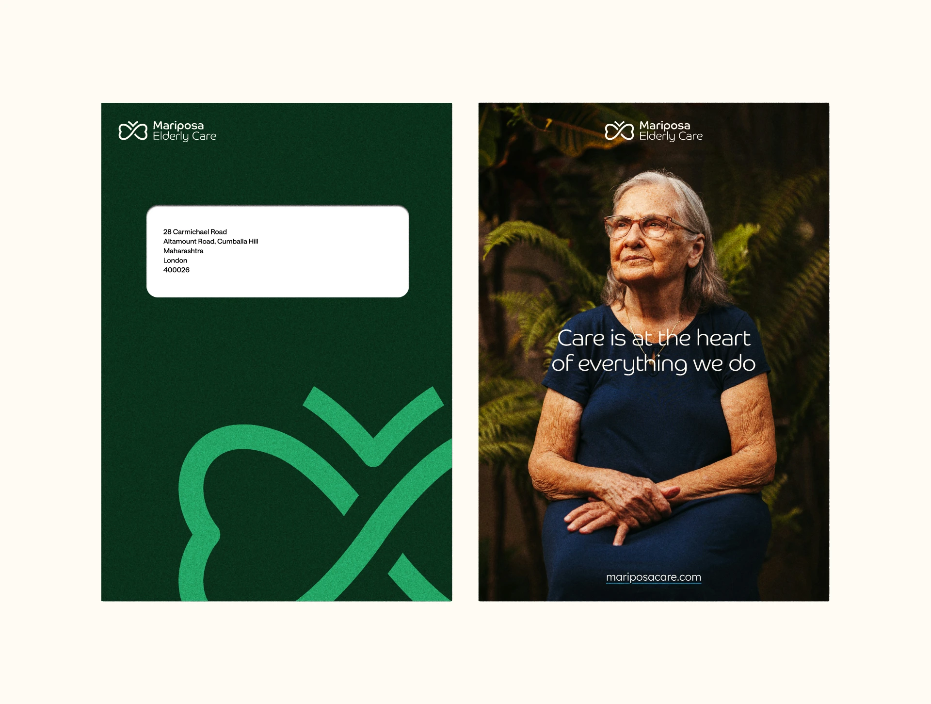
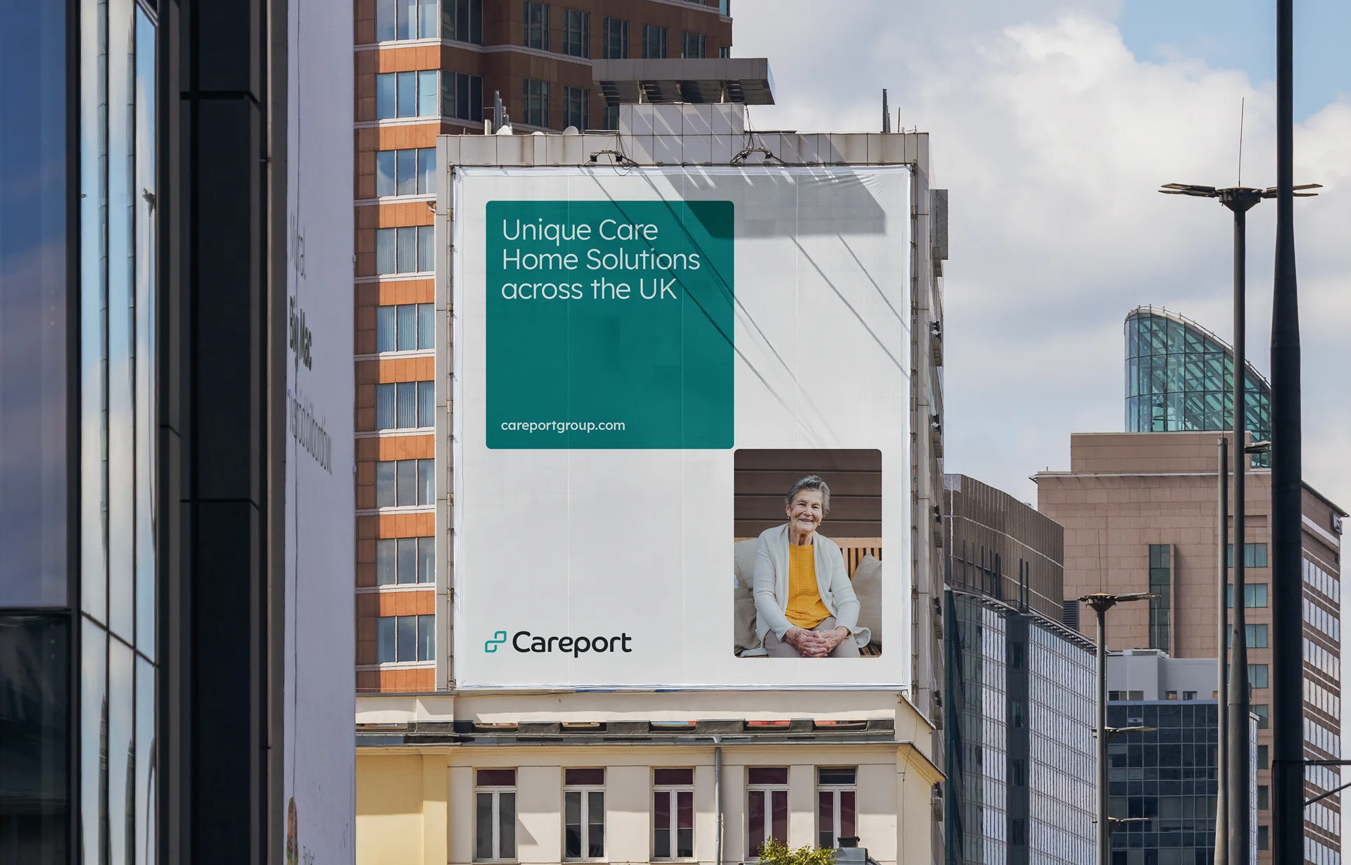
We refined existing brand assets across the group while introducing a shared visual language comprising typography, iconography, colour systems and UX principles. Particular attention was given to Careport itself, evolving the parent brand into a more confident and contemporary expression capable of representing the organisation as a whole.
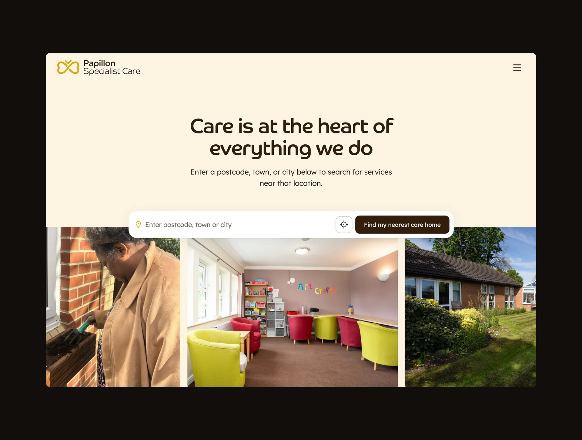
At the same time, we developed a unified digital strategy that balanced consistency with individuality. Mariposa retained its warmth and approachability, while Papillon adopted a more refined and premium aesthetic. Careport became the connective tissue between them—providing a central destination for the group's vision, services and future ambitions.
Every decision was guided by a single objective: create a family of brands that felt distinct, connected and built for the future.
Process
The project was delivered across four stages over fourteen weeks.
We began by establishing a refreshed identity system for the group, refining existing logomarks and creating new brand assets, typography systems and usage guidelines. This foundation informed the redesign of all three digital experiences. From there, we developed full UX and UI concepts, consolidating design patterns and introducing greater consistency across every touchpoint.
With the strategy and design language established, we moved into implementation. Existing websites were audited and rebuilt using modern templates, improved content structures and enhanced functionality, giving internal teams significantly greater autonomy over content and communications.
Finally, each website underwent extensive testing, optimisation and deployment to ensure the final experience delivered against the original strategic intent—providing a scalable platform capable of evolving alongside the organisation for years to come.


Solution
Today, Careport Group presents itself as a modern family of care brands—united through a shared design language while retaining the unique personalities of Mariposa Care and Papillon Care.
Careport has evolved from an overlooked parent organisation into a confident brand with a clear purpose and identity of its own. Meanwhile, both subsidiary businesses benefit from modern, intuitive digital experiences designed to better serve their audiences and support future growth.
"WWWonder transformed Careport, Mariposa and Papillon into a cohesive brand family - distinct yet connected. The strategic branding paired with genuinely stylish, technically polished websites has elevated how we present ourselves across every audience." — Chris Beastall, Director, Careport Group
Beyond aesthetics, the project introduced a more flexible and scalable technological foundation. New templates, improved CMS functionality and enhanced user experiences provide internal teams with greater control while reducing reliance on external support.
The result is more than a collection of redesigned websites. It is a connected brand ecosystem—one that gives Careport Group the confidence, clarity and capability to continue shaping the future of care.



.webp)
